The RYA recently unveiled a new logo and pseudo-strategy following “extensive consultation” to “create a connected and inclusive community on the water,” and it’s causing mixed reactions online. (Facebook Discussion)
Should an organisation of this age and with a logo so recognisably synonymous with sailing training have gone in this bold new direction?
There may be justification for it.
The reasoning lies within the primary objectives of the new “Together on the Water” mission statement: inclusion and openness. It appears the RYA is attempting to broaden its appeal, having missed an opportunity to increase memberships, despite the uptick in water sports participation due to the pandemic and with numbers in dinghy racing in decline.
In the pursuit of inclusivity, the RYA may be trying to move away from the colours of the Union Jack. Is this an attempt to shed the skin of a solely ‘British’ yachting organisation at the cost of their recognisable brand colours? Has the Union Jack become negatively associated with far-right politics in the UK? And in order to remain relevant to ethnic minorities, do brands need to disassociate themselves from a once proudly British identity?
The imagery on the mission statement document includes younger, ethnically diverse groups sailing in harmony, likely designed to eschew the perception that sailing is a “elitist,” upper-middle-class, white male-dominated sport.
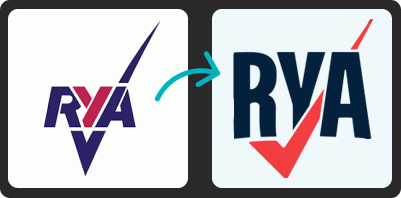
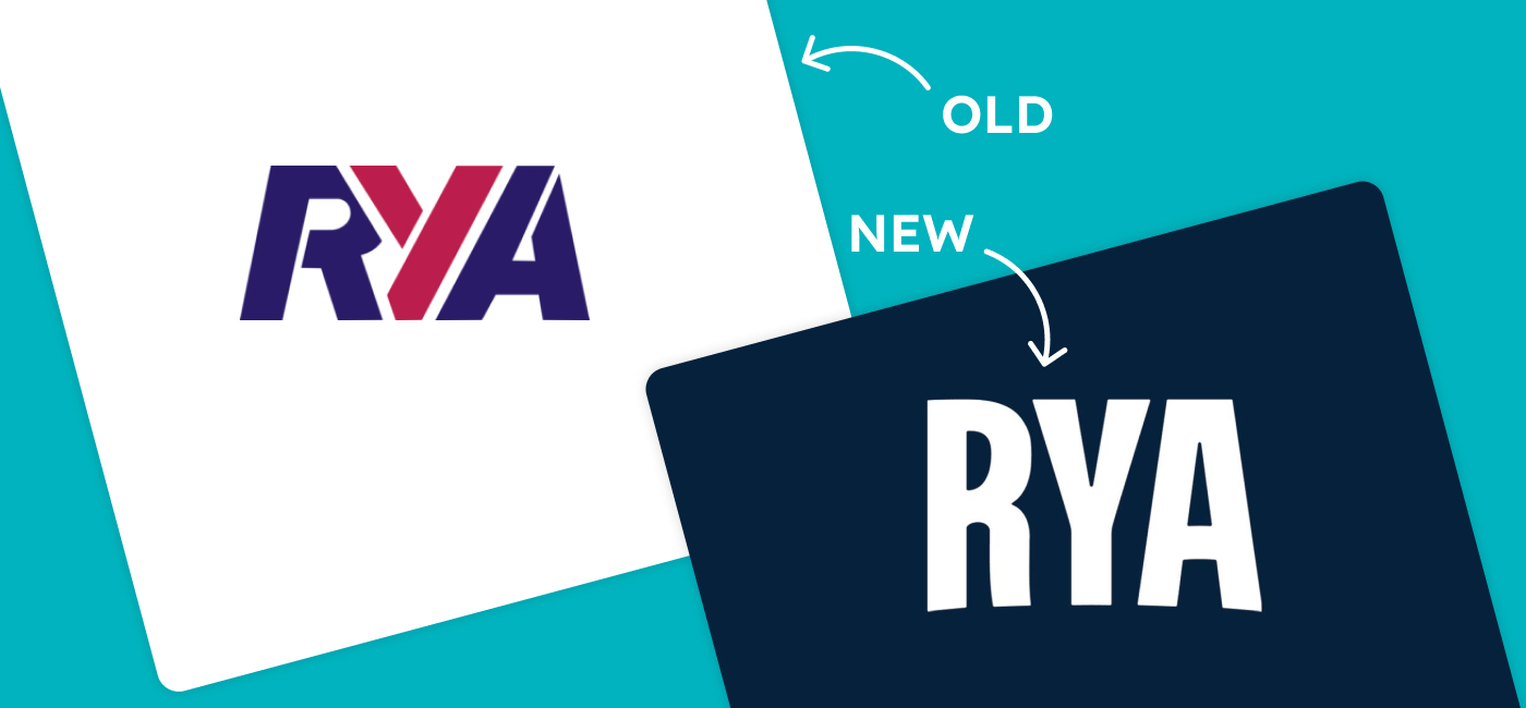
Looking at the update itself, if I hadn’t seen it on the RYA website this morning, I would have thought the logo represented a different organization. To me, the logo looks more suitable for field sports and has little association with sailing. Dropping the red and blue color combination in favor of a single dark “royal” blue and bland sans-serif font has made a once distinctive logo forgettable.
Only time will tell if this logo update will be as iconic. Whatever your opinion, kudos to the RYA for opening a new chapter with a bold logo refresh as they change tack towards a new broader audience.
See the mission statement here.